March - May, 2022 (~20 hrs/wk)
Independent Project
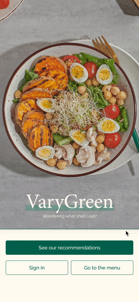
Mobile Application Design
UX&UI Designer | UX Researcher
Design a product from scratch without the background of the problem, context, and users.
Defined users and market, developed business value propositions, and delivered high-fidelity prototypes and design system
← A question usually pops up at least THREE TIMES a day in many people's heads. The truth is, if we want, there is always something in the fridge, in the office drawer, or in the corner convenience store waiting for us to open the packages.
Thus, what people really are asking is, “what is the appropriate food to eat?”
Humans absolutely need calories to ensure the basic functionality of living, studying, working, and relaxing. Having appropriate food, which equals a healthy diet in most people’s definition, can sustainably ensure so for the longer term.
When I asked many people what a “healthy diet” means, the word mentioned the most was “balance”.
“I need a balanced composition of fat and vegetables.”
“I will balance my plate with the cheat meal.”
However, doing the calculation while considering all the trade-offs is a challenge.
Thus, the project's mission is to find the balance between users’ healthy concerns, body situations, diet styles, and daily scenarios.
The product aims to answer the question:” what is the appropriate food shall I eat?”
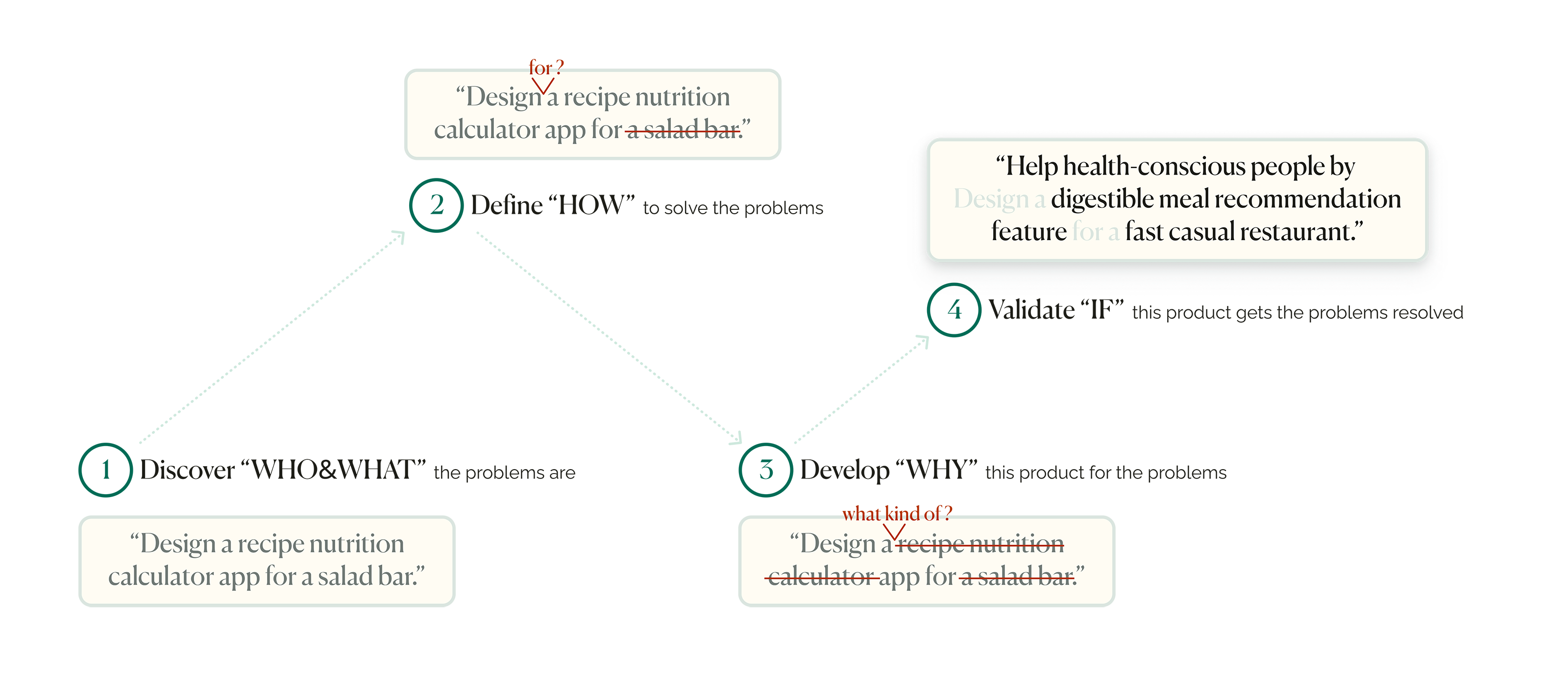
As a starting point, the initial design prompt was straightforward, with barely any context or problem to solve. Thus, besides discover-define-develop-deliver as the conventional process of designing this product, the whole journey is also the process of going from don’t know what it could be, to do know what it should be.
To design a useful product, I needed to ensure I was not diving into a dead sea but a space where I could craft values. I had to understand the market's existing situation, challenges, and opportunities to picture what the product would look like.
To figure out who I was designing for and what problems I could help resolve, I took a deep dive by researching diet-related data and news:
Unhealthy dietary trend. Groups between 20-39 and 40-59 ages are at the most risk of obesity, with serious health and financial consequences. [World Health Organization] [CDC 1999-2017] [CDC 2017-2020]
Dining out habit: 84% 20-39 ages and 75% 40-59 ages order from a restaurant at least once a week. [Technomic]
Re-bouncing workday meal needs: Because of the hybrid RTO(Return to Office) models, more and more workers are returning to the office. [NYC] [Statista] [Cushman&Wakefield] [TheWallStreetJournal]

By doing the research, I defined:
Bringing the macro user portraits forward, I wanted to go micro to understand users’ considerations, emotions, and motivations behind behaviors.
I had eight user interviews and asked questions about the considerations that emerged before/during/after ordering a meal they would consider as healthy. Then I used the empathy map and documented every interview's verbal data to translate what they said into what they thought.
At this moment, I understood users' pain points and motivations at the general level and summarized them as three archetypes.

By doing the user interviews, I defined:
3 Archetypes:
Since this phase's goal was to comprehensively discover what the users want, the archetypes were still too broad to draw the user pictures.
So I generated three personas at mixed levels of the three archetypes.
Furthermore, I defined users' desires by writing down the user stories, goals, and frustrations. The desires would be translated into actionable design ideas in Phase 3.


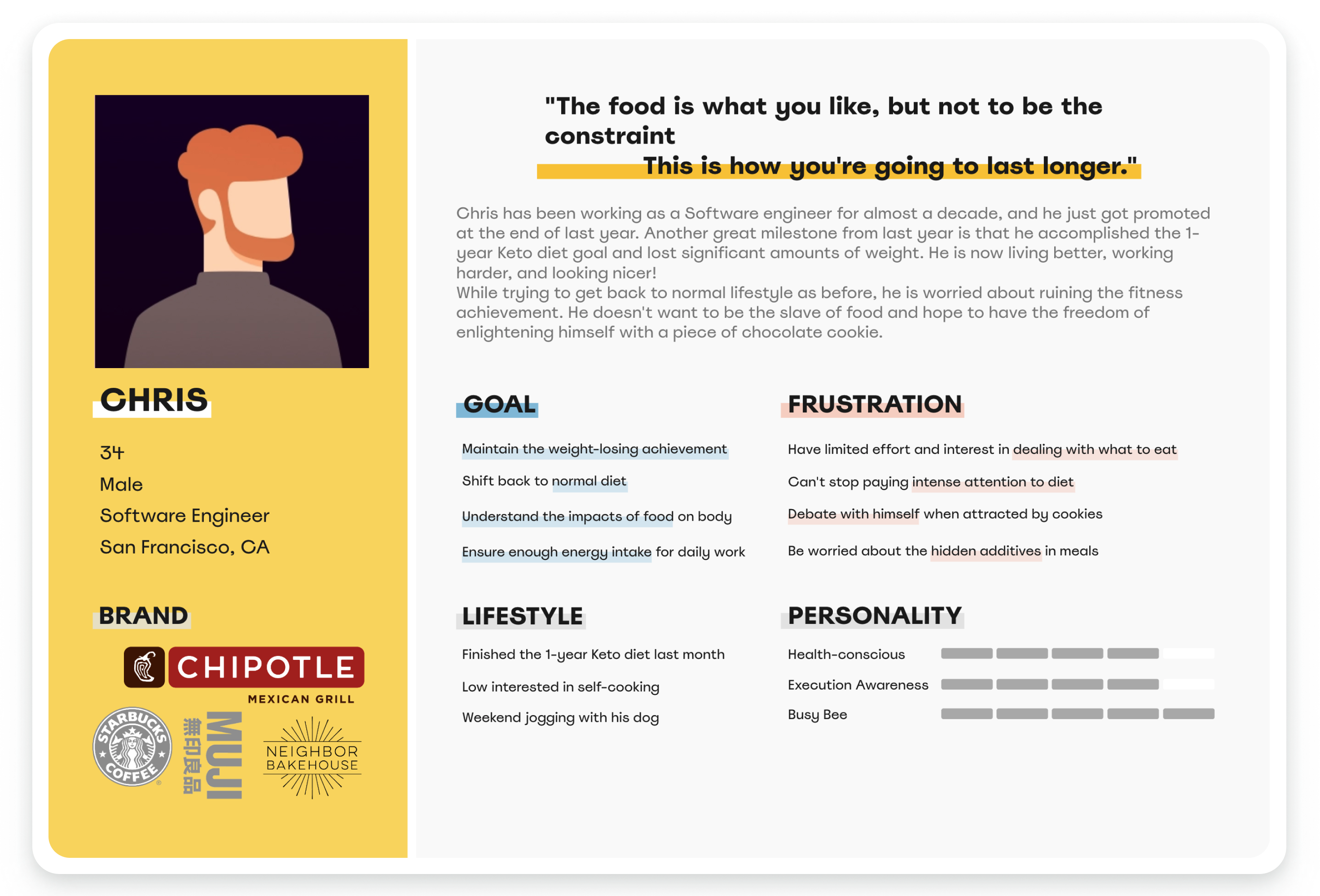

By building 3 personas, I defined:
6 User desires:
Before jumping into the rabbit hole of ideation, there is still one question: where will the users go for the meal?
To answer the question, I researched users’ dining trends and found that the fast-casual restaurant (FCR) market perfectly matches all the users’ dining trends.
I analyzed direct(Sweetgreen, Chipotle, and Panera) and indirect (Platejoy and Mealtime) competitors. It helped me to understand the FCR market standard features.

By analyzing the fast-casual restaurant market competitors, I understood:
Market standard features:
By discovering the user groups, user problems, user desires, and marketplace, it’s time to make sense of my research. I practiced HMW to synthesize the right problem and phrase the product vision accordingly.
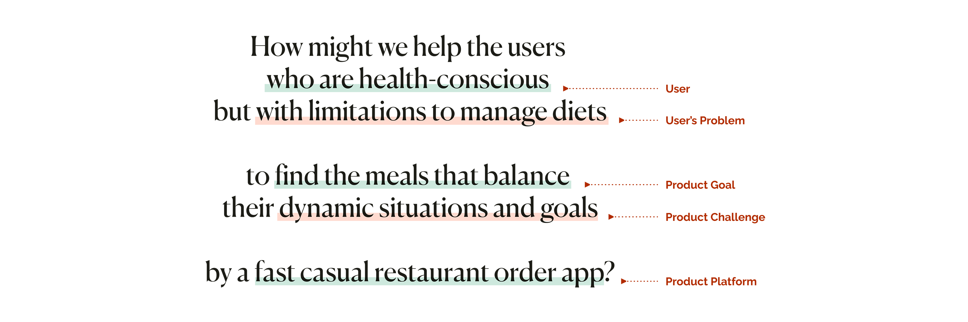
The definition of a mobile order APP was far less than enough. In other words, why VaryGreen? What makes it unique? Why don’t users just go downstairs and grab a sandwich from the closest salad bar?
I wanted to develop an advanced feature to resonate more with users.
To make the product stand out, users need to see the value of using it. I always believe that the answers to all user-behavior-related questions are just hidden behind what they do and say.
So I went back to previous research insights and translated the user desires into 3 value propositions.
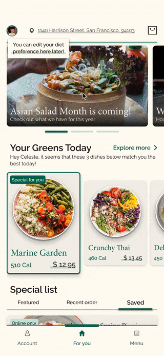
Users tend to create a stronger emotional relationship if they are provided with tailored meal recommendations that catch their flexible dietary preferences and scenarios.
Being vegan, taking a keto diet, being allergic to dairy, having an upcoming fancy meal, and staying within a specific calorie range... can all address a sense of personalization.

To address the value of personalization, i designed to:
The fewer efforts users spare to complete a task, the more willing they are to return. Most users are not interested in finding the one-and-only dish from a long menu list.
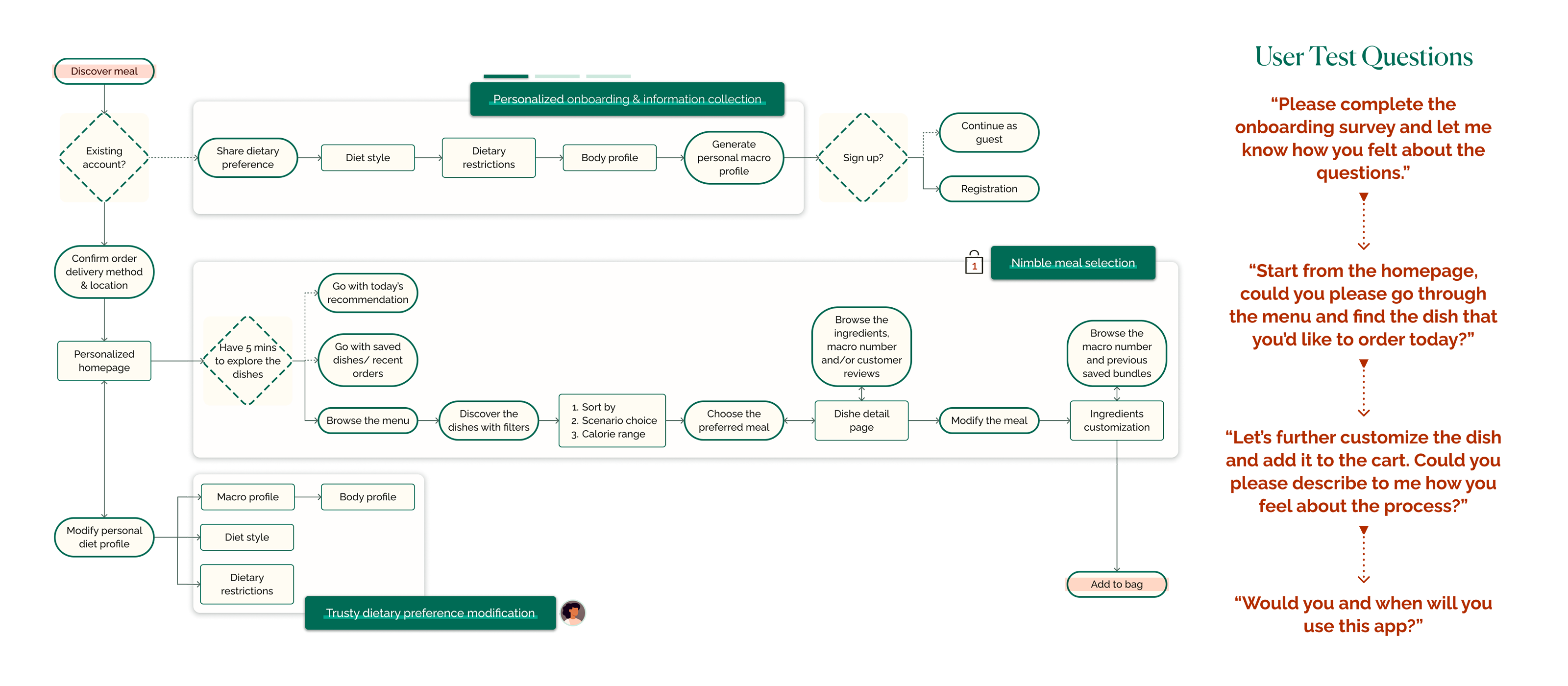
Thus, a nimble order process means landing at the confirmation page as intuitive and agile as possible from the second of tapping the APP.

To address the value of nimbleness, I designed to:
If the product cannot convince the users to tap the confirmation button, then all the previous values mean nothing.
Users tend to trust you if they see how the information they provide is reflected and how the dish will impact them.
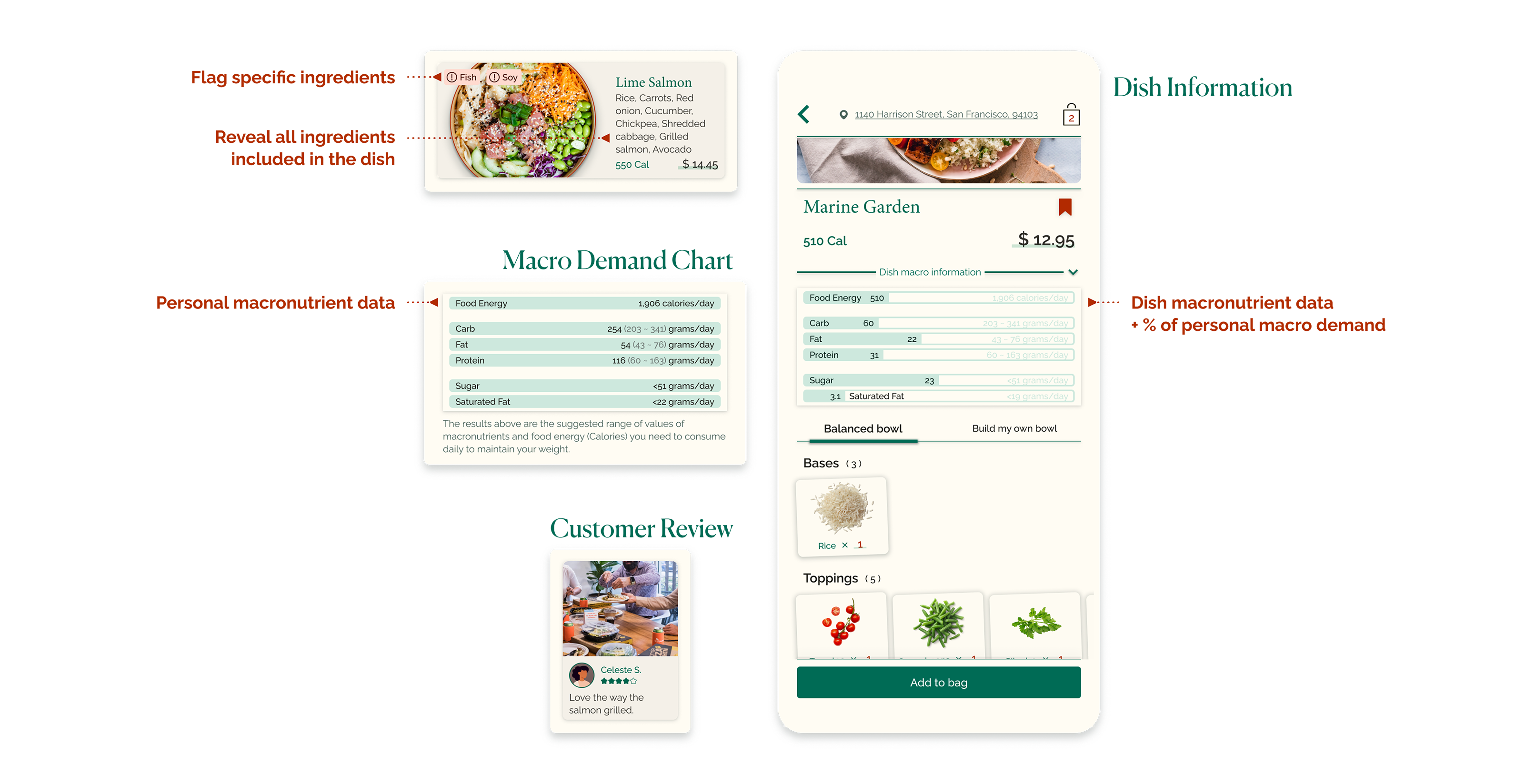
To address the value of trust, I designed to:
A product can never be called a product until users examine it. I needed to validate if the product experience would be as personalized, nimble, and trusty to users as I proposed.
To validate the values, I designed three targeted tasks throughout the whole user flow. 8 of 8 user test interviews were the target users in the age group with workday meal needs.
With all the good comments, I used the affinity map to tame complexity, understand the priority from ambiguous data, and identify themes.
In conclusion, the most significant issue that emerged after analyzing was: the product was not easy to digest.
By analyzing the user test results, I found that:
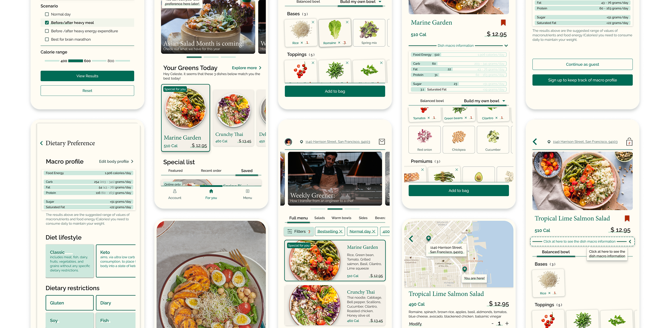
Responding to the overwhelming information, I lessened complexity by progressively disclosing it.
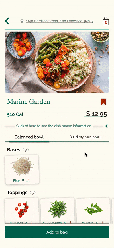
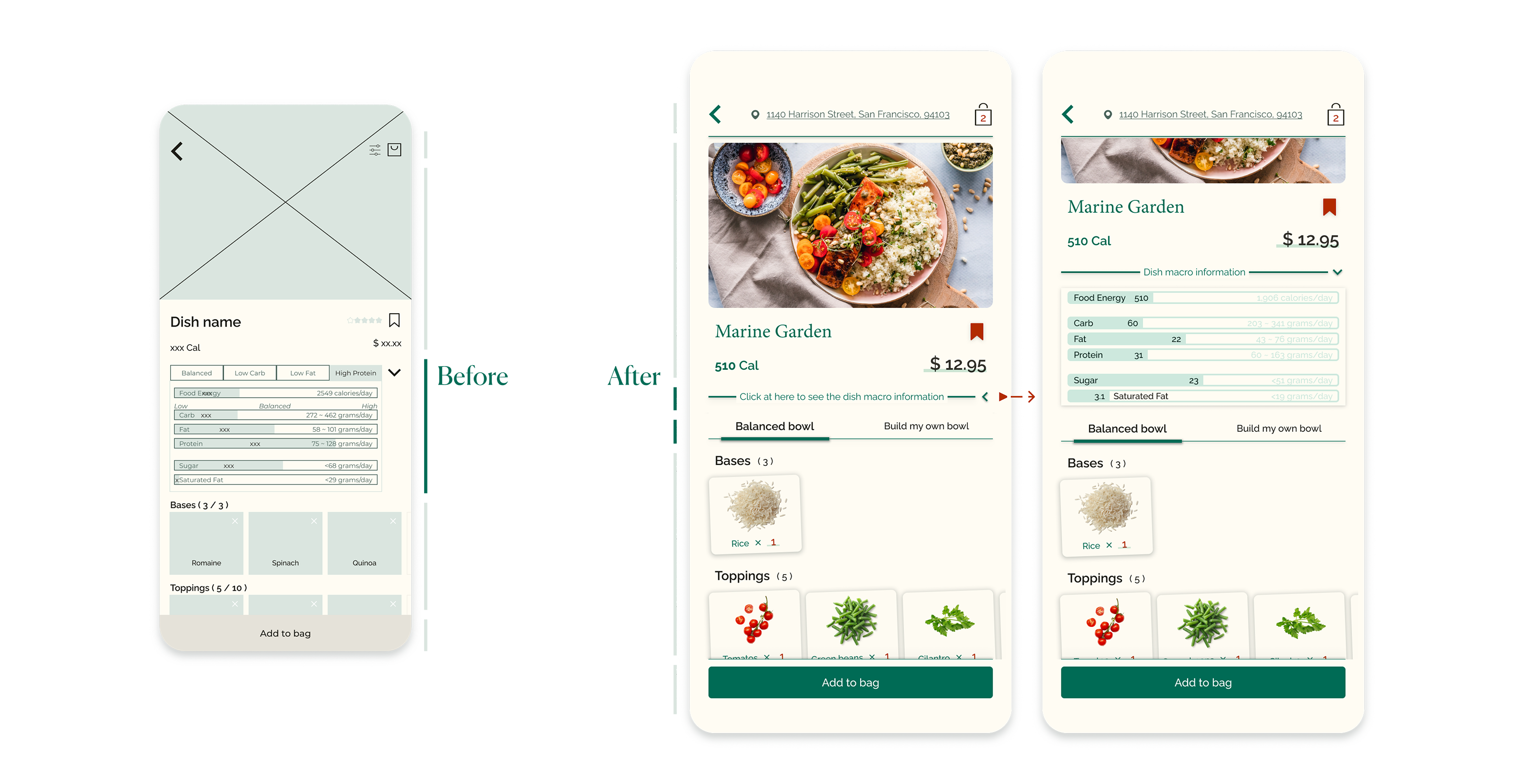
I designed to hide the irrelevant information until it becomes relevant. The macronutrient chart won’t be shown in the first place until the users want to know more. Besides, the users will also have a delightful sense of control by tapping to drop the chart down.
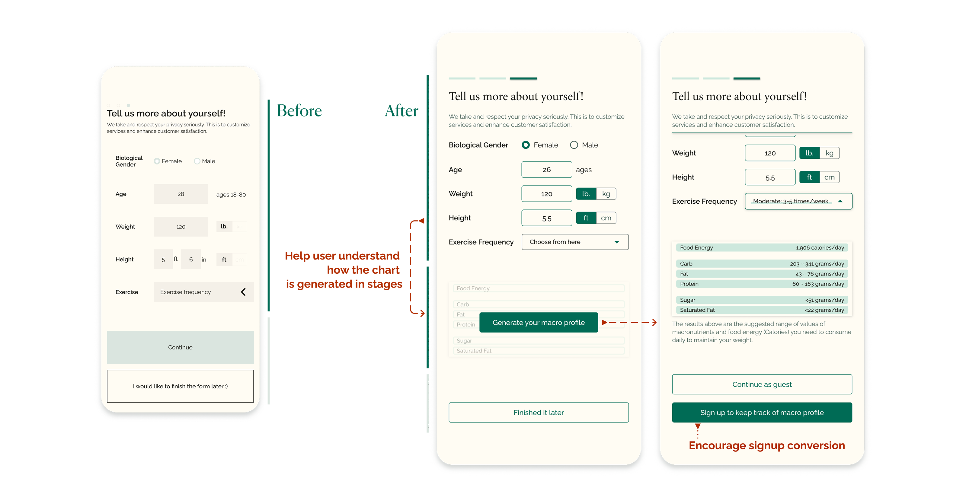
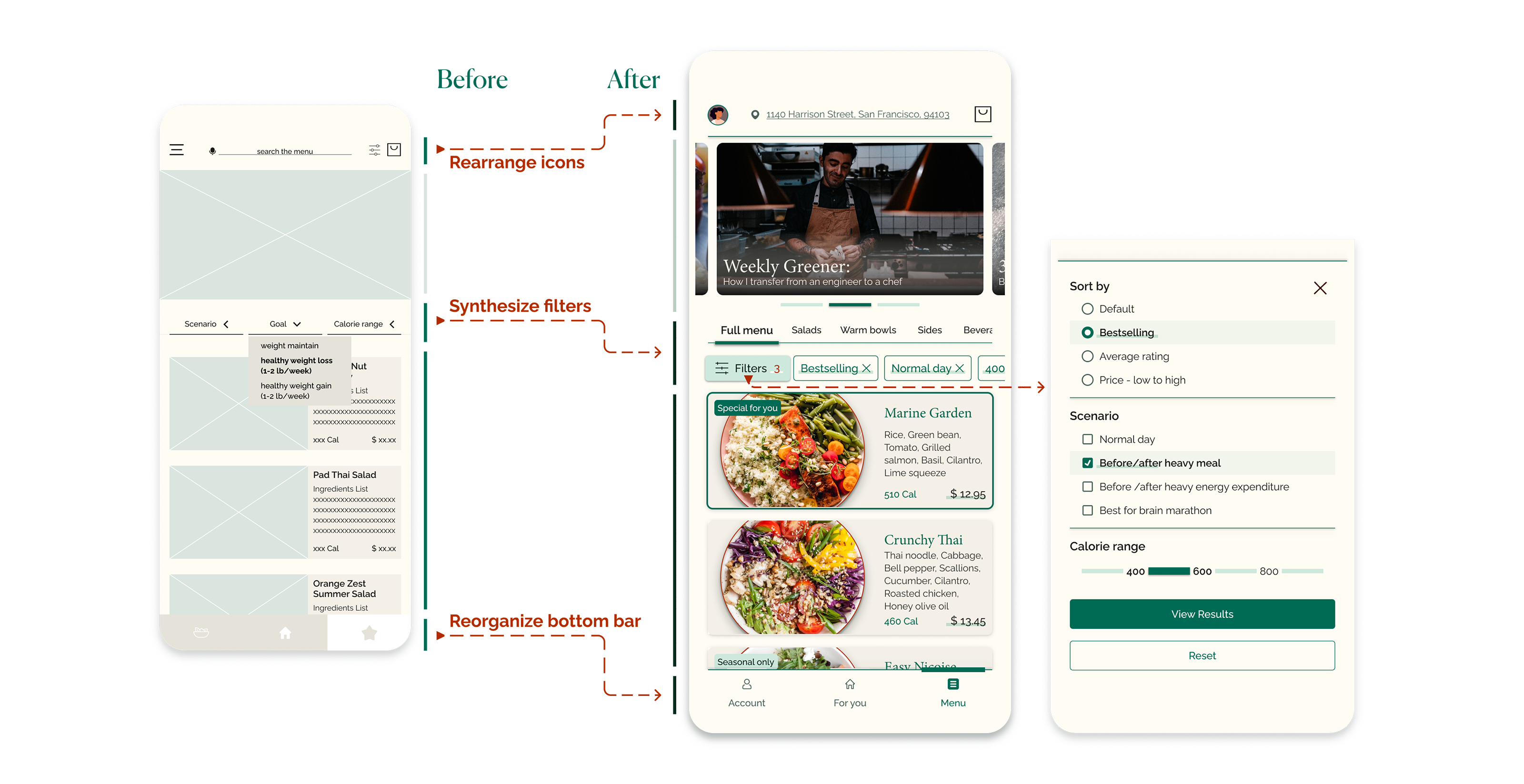
Responding to users having difficulty locating touch points to complete the task, I improved the visual readability.
I improved the content hierarchy by adjusting&adding text, size, color, orders, and graphics.
I also followed best practices since users are more familiar with the existing modes.
For example, after studying the same feature in Yelp, Airbnb, Postmates, and Target, the filter was changed from the dropdown to move-in. In this way, users can review all the options at the same time within a single click.
Responding to users feeling some order steps were redundant under specific situations, I simplified the customization feature to support a quicker decision. The customization sets were removed since most interviews criticized them as “unnecessary”. It will reduce the decision points from 4 to 2.
Meanwhile, I split the macronutrient chart and customization feature. It will avoid the users being distracted by the numbers when trying to make a decision.

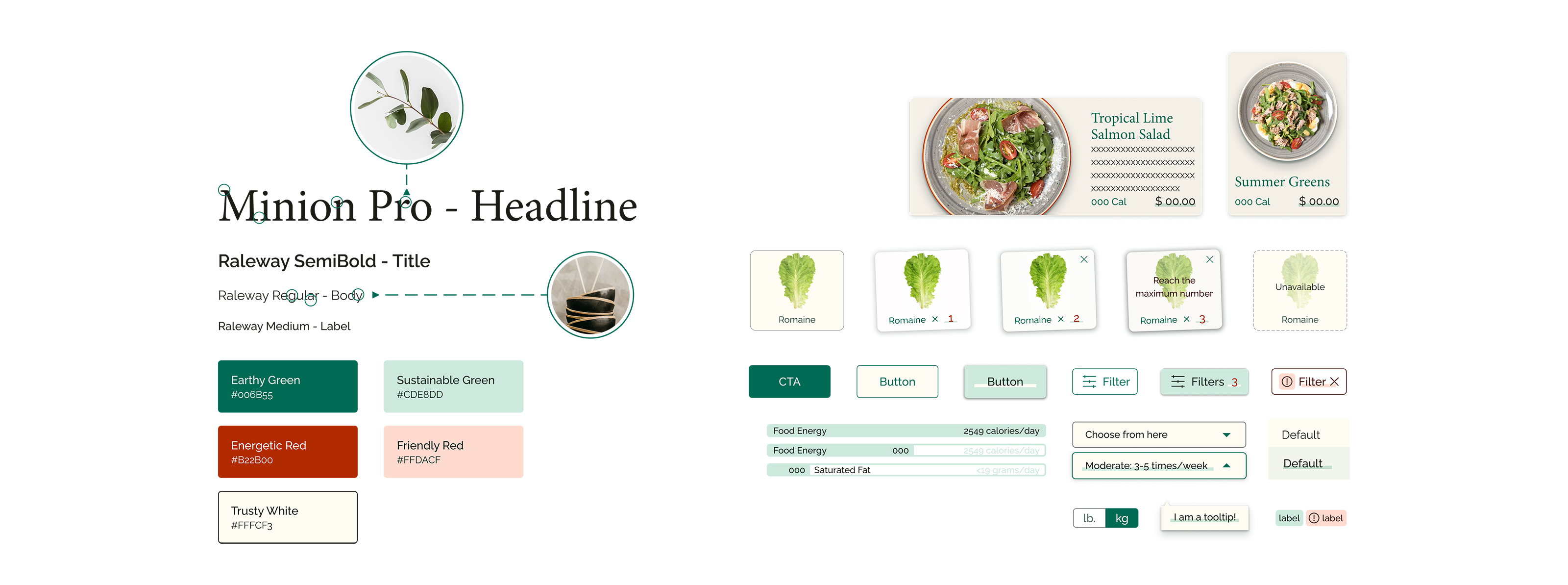
Google Material Design Kit helped me to jump into the rabbit hole of the design system, and thinking through the typography, color palette, components, and even writings put me into the shoes of the business to convey its personality to users through the design system.
Besides, users tend to think the design is more usable if it’s visually lovely.
Users will not only start building trust with the product but also be encouraged to learn and track their body health.
Explore the dishes they love, manage diets, and learn interesting health tips... Users will have fun looking into all the great features with easy access.
Users can either follow the perfect pre-set composition of the dish or their own heart to build the bowl. The comprehensible interface will satisfy such needs without difficulty.