July - Present, 2022 (~20 hrs/wk)
Dumbarton Oaks Park Conservancy
Website Redesign
Product Designer | UX Researcher
Have limited access to direct park users, and need to redesign the outdated website for MVP launch within a tight schedule.
Delivered high-fidelity prototypes for MVP launching, and developed a design system for public branding.
Dumbarton Oaks Park (the Park), is one of the national 10 greatest landscape designs. It was designed by the first female landscape architect in the U.S.As time goes by, the 27-acre Park has deteriorated significantly during the last half century due to invasions, hydrologic issues, and resource limitations.
It is gradually forgotten by the local neighborhood and the larger society.
Dumbarton Oaks Park Conservancy (DOPC) aims to restore, conserve and promote the Park. it seeks to bring this historic landscape back while also enhancing its modern-day utility to the national capital community.
It hosts volunteer programs, collaborates with local engineers, and raises donations to restore the Park back step by step since 2010.
Restoration work needs support in the form of volunteers and donations. Thus, the mission of the website is to facilitate the park visitors to be the supports.
As a product designer, my strategy was to use the website as a platform to tell a consistent narrative between offline placemaking, and online storytelling.
I was responsible for the entire user research&analysis and website design parts. We aimed for an MVP launch on October 31st and will keep refining the website after that.
Instead of following a linear business-user-problem-design process, I evaluated the problems and opportunities from a business-driven scope, and follow up with a user-driven research filter.
The reasons for so were:
1. Since the ultimate goal is to acquire targeted support from users, this project is user-focused while business-oriented.
2. To simplify the steps and practice an agile approach for an MVP launch

To achieve the user role conversion (visitor → supporter), I needed to understand who are the visitors, who are the supporters, and what resources we could provide to trigger the conversion.
While viewing from a business-driven scope, there is a risk that the users’ needs are under-addressed. So I helped the team, including me, build a UX mindset. With the team, especially my client, I discussed the project visions, sketched out and shared the initial user journey, brainstormed the goal, role, and contents of the homepage, etc.
Within so, I helped put the team into the users’ shoes.

By building the UX mindset, I:
The advantage of a redesign project is that I already had the website at hand to analyze. the analysis helped me to understand the resources that DOPC could already provide, the website navigation, and the work scope.
I used the homepage to unpack the existing information architecture and sitemap.

By evaluating the existing website, I:
Due to some constraints, the team decided to not move forward with user interviews, so I need to find other ways to validate the user characters to organize the website contents.
This is the moment that the preset UX mindset got leveraged. Collaborating with the project manager, we thoroughly workshopped the types, characters, motivations, and needs of users with my client.
But the user analysis was still too abstract to draw the user pictures. Thus, I practiced proto-personas to visualize the specific needs of the three key users - visitor, volunteer, and educator.

By analyzing the users with my client, I understood:
By practicing the proto-personas, I summarized:
Within the imperatives, I finally could understand what are the essential things that the website users will need to accomplish the role of park supporters.
I applied user journey maps to the three key users and laid out the touchpoints, emotions, actions, and opportunities accordingly.
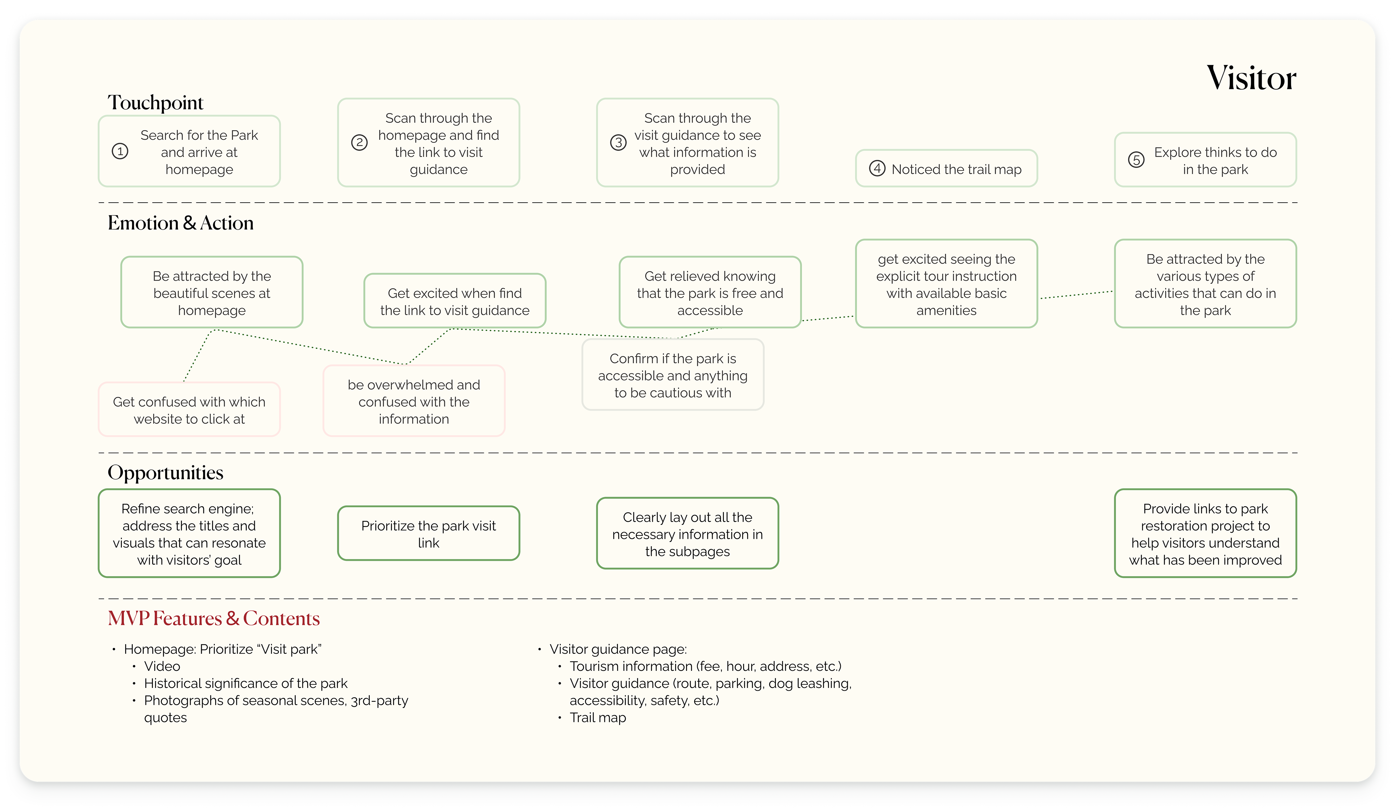
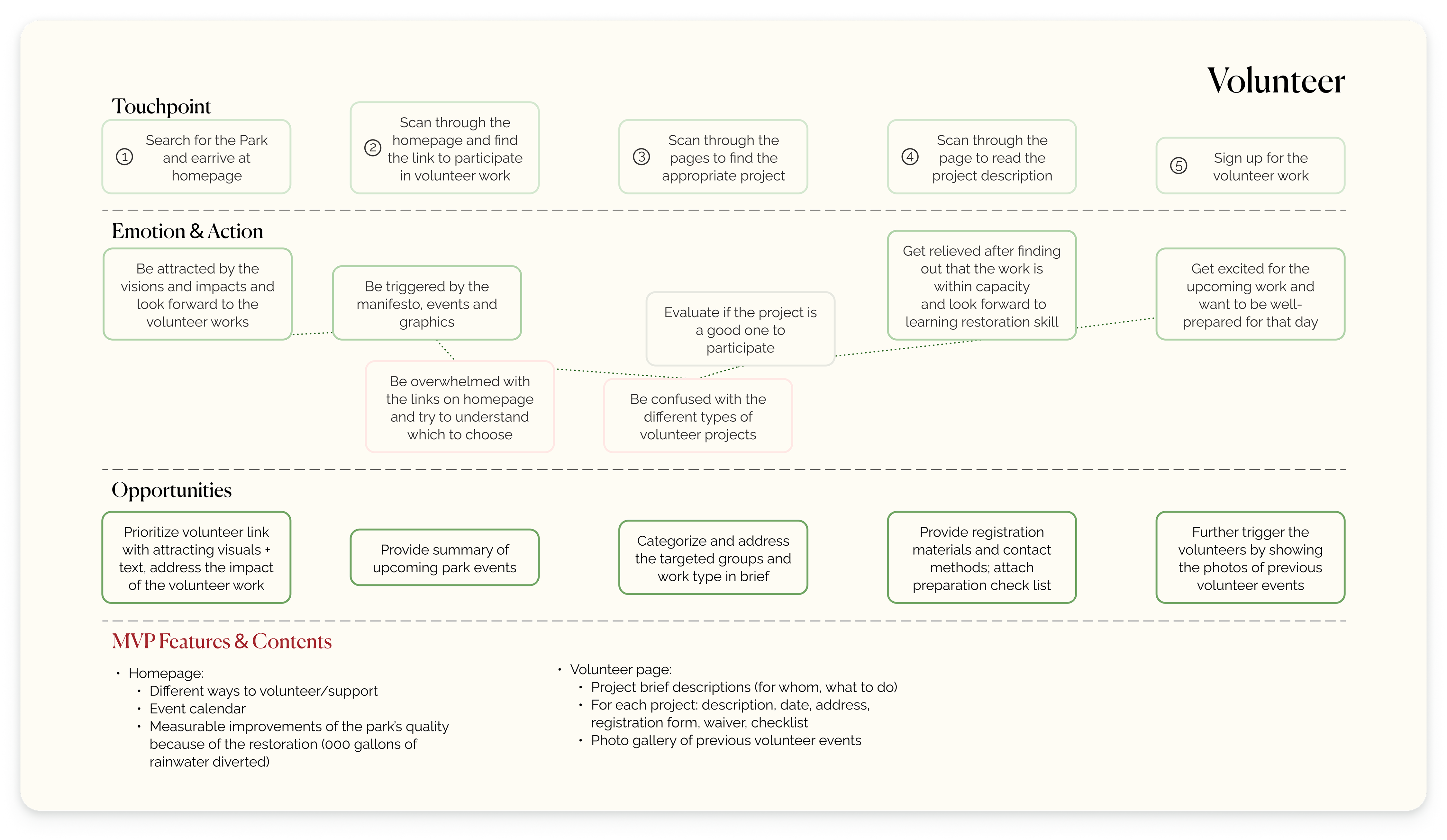

By building the user journey maps, I summarized:
To create a website that can encourage users to support the park, I believe adding user-driven research as a “filter” is important to tell a resonating story.
If the proto-personas represent the users that DOPC knows, then this step is to discover and understand the users that the business doesn't know. More specifically, who are the users at the scope of market-wide, park-wide, and website-wide?
Starting with the widest scope, I wanted to understand the typical design standards and features of non-profit websites and park-related websites.
By researching and doing market analysis (a park is never a "competitor"!), I learned some features and design tips that shall be applied to create a basic user-friendly non-profit park website.
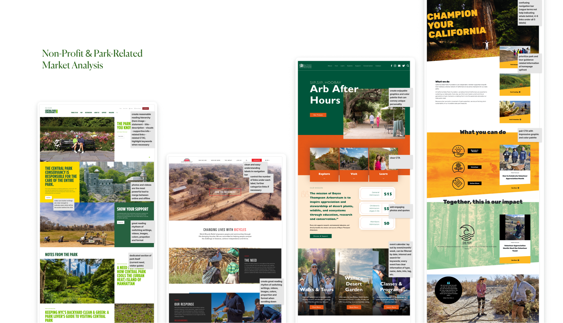
By researching non-profit and park-related websites, I:
Although no space for an expansive user interview session, the team accepted my proposal of doing focused group interviews. The goal was not to literally include whatever people requested, but to understand the values that people appreciate and expect in the park, the conservancy, and the website.
The key findings here were all later translated into design languages and applied to later website UX&UI design.

By doing the 4 focused-user interviews, I understood:
The online website users were definitely the group the DOPC barely has the chance to get in touch with. Different from the sitemap analysis, this step focused on learning how users perceived the existing website.
I did the card-sorting exercise, analyzed the website traffic statistics in the past years, and reviewed the accessibility report.

By analyzing existing IA, website traffic statistics, and accessibility report, I determined:
With the business-driven scope and user-driven research filter, it is time to ideate the findings for launching the MVP.
In other words, how might we convert the park visitors into supporters and facilitate more contributions?
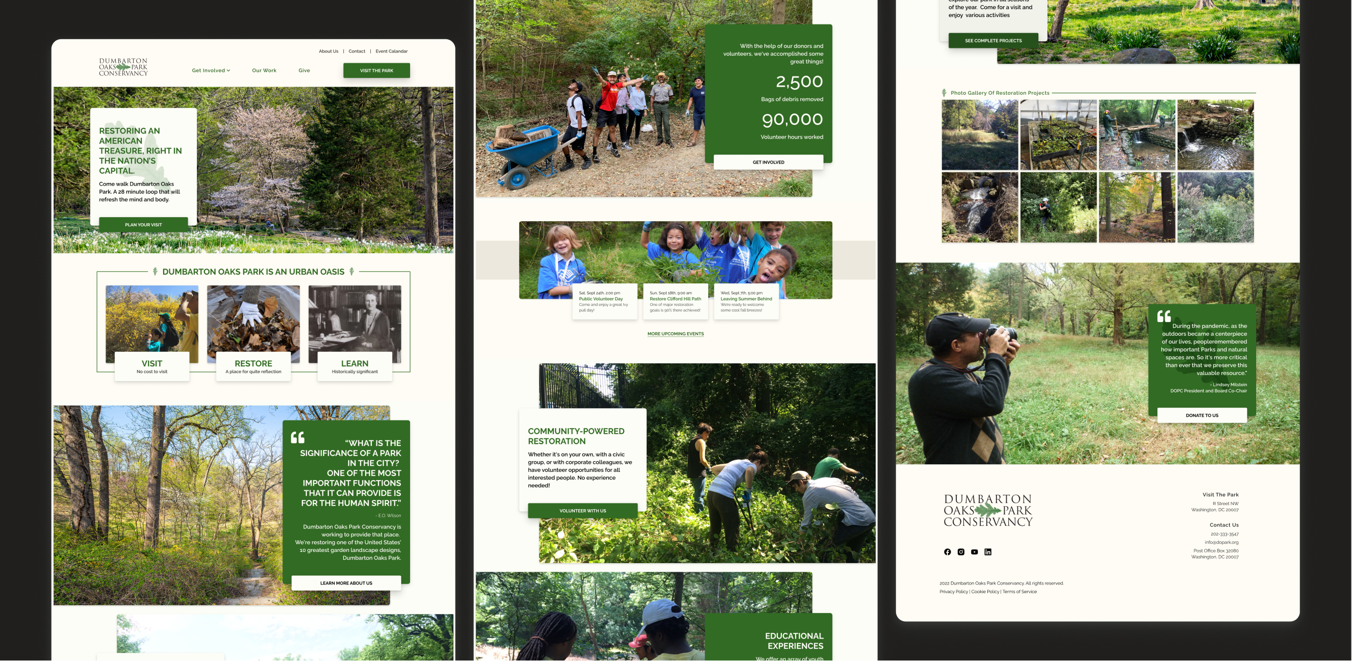
As the most essential landing page, the homepage plays the role of facilitating the visitors to appreciate the park, learn the efforts behind beauty, and most importantly, what their roles in the efforts could be.
To create such an enjoyable flow, I strategically prioritized the four core values that DOPC wants to address, followed by actionable support methods, and end with extra inspiration.
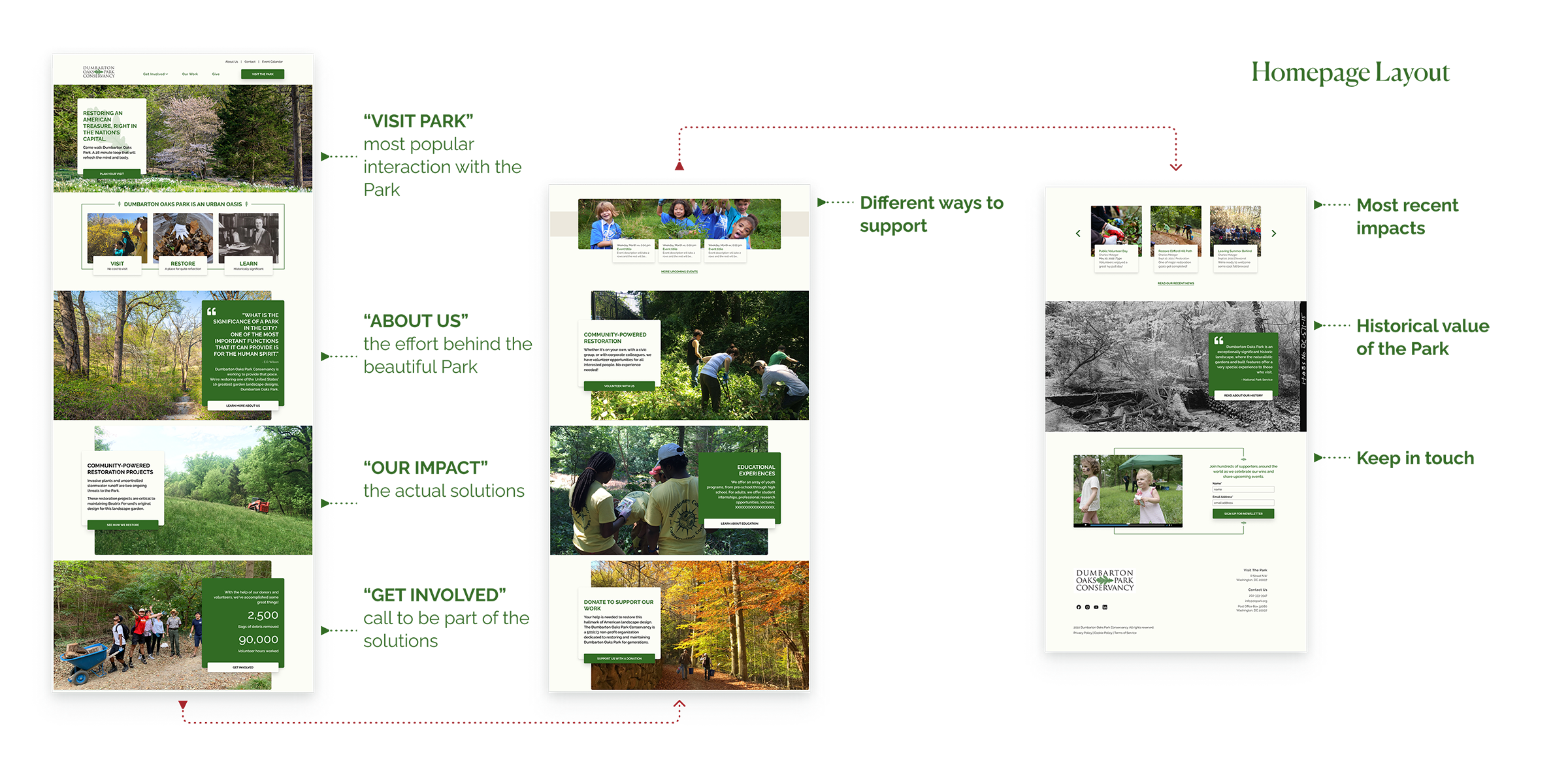
Additionally, to fulfill visitors’ needs while motivating them to scroll down to make the role conversion, I designed for the first fold, used quantifiable numbers, and inserted an event calendar and videos - using understandable and actionable details to put the visitor’s feet into the supporter’s door.

Once the seeds sprout, comprehensible navigation will ensure that the users can easily find the information they need to consistently grow with nutrients.
I laid out the sitemap and iterated the inventory based on previous research. Incorporating the future program operation and web development concerns, I packaged the final sitemap, MVP features & contents, and the navigation bar to share with the engineer and content copywriter for reference.

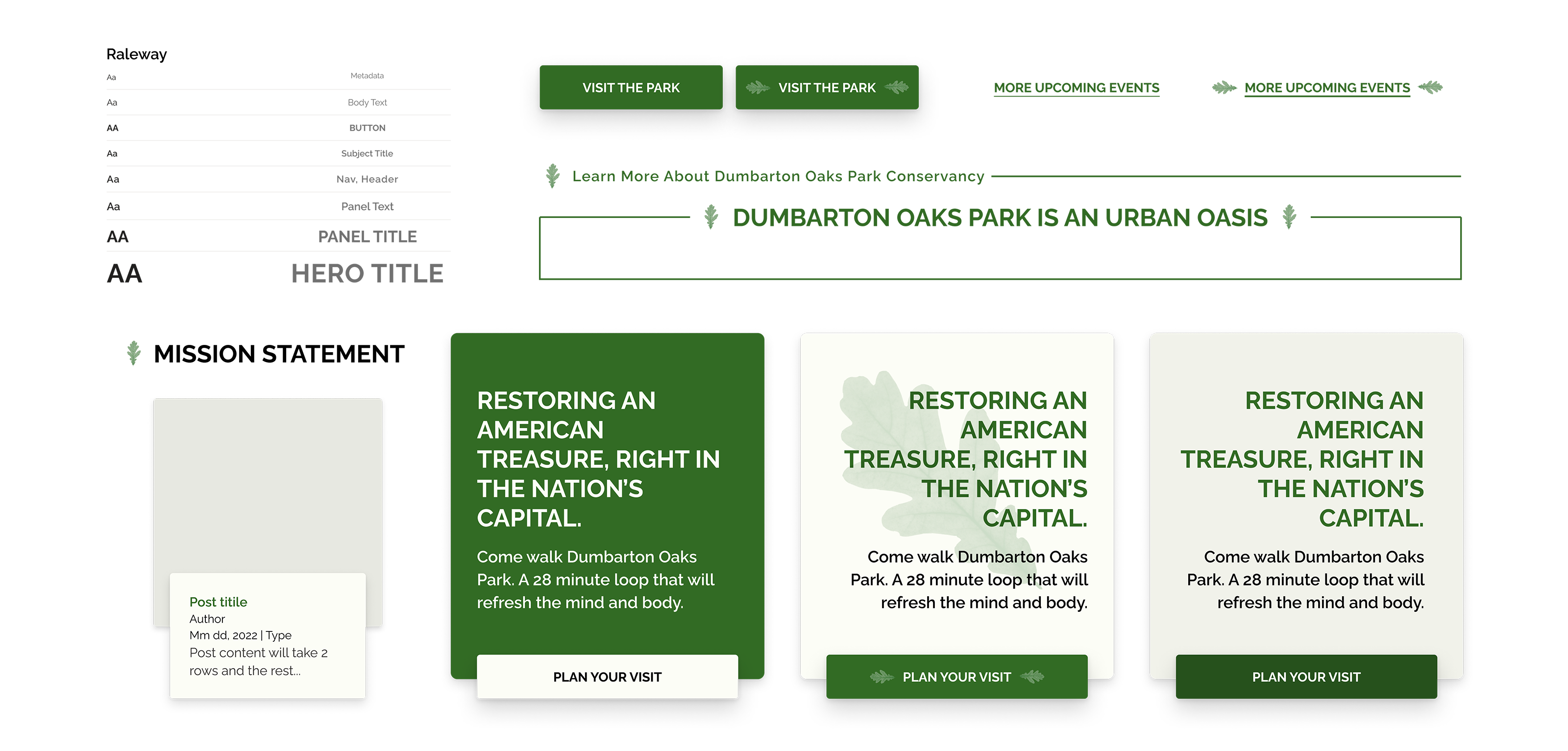
With the developed facades (homepage) and structure (sitemap), I could finally add delightful “decorations” to create a more welcoming, comprehensible, and user-friendly website.
To avoid users feeling overwhelmed while diving deeper and absorbing more and more information from the homepage to subpages, I applied the same kind of panels across pages while adjusting the proportion of the text and images to generate a sense of hierarchy.

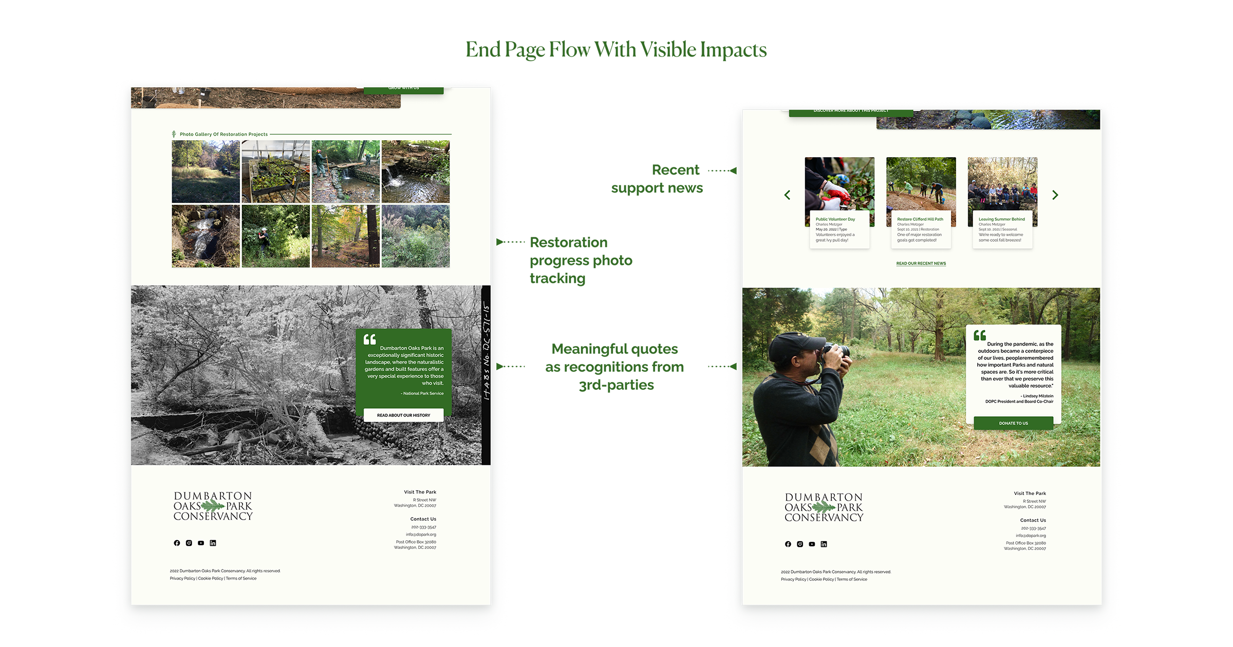
People tend to feel engaged and identified if they can see the impacts they’ve made or they can make. So I added visible impact before the end of the page flow, such as restoration photo tracking, volunteer photo gallery, recent support news, and meaningful quotes as the recognitions from some 3rd-parties.
During the focused-group interviews, everyone mentioned that the Park shall be credited for the varied, ever-changing scenes. So I proposed to seasonally apply different scenes of the Park to the hero and footer image sections to remind people how beautiful the Park is.

Based on the oak leaf icon from DOPC's logo, I designed the system for DOPC’s future public presentation and annual report usage beyond the website.
Besides the pages illustrated above, I also designed several other pages, such as (1)Project Summary, Project Profile, (2) Donation methods, Individual Donation, (3) Event, Contact, etc. - which are all developed into the MVP version.


